

ABB Ignition Reports
Redesigning how we report fires in the field

Project Overview
Problem:
Troublemen are hesitating to submit ignition reports when they are required to be first responders on the scene. Our team was tasked to find out the reason behind the hesitation and overhaul the workflow to meet the needs of our users.
Solution:
A proposed fire tab enhancement with updated workflow, new text changes, clear definition for fire incidents, access to fire tab from non troublemen, GPS location among other quality of life features that needed to be prioritized.
Impact:
An overwhelming 100% increase for safety reports and 53% increase in user satisfaction.
My Role:
User Research, Field Research, IA, UX Design, User Testing
DEFINE
Project Details
It is really cool shadowing troublemen when they are out in the field, depending on their assignment, they could be deeply entrenched on the city streets observing electric poles, or out in the middle of nowhere, inspecting 500kV electrified towers that power our homes.
So it was really surprising when there were so many ignition reports going unwritten. We had a discussion with business about what the root cause of the hesitancy was coming from and got many different answers. Information recorded not being specific enough, data disappears when sent, the culture surrounding an ignition and being held up in court for months and months.
Our work remedied most if not all of the issues our users were facing but also had a significant spike in reports once the new features were pushed into production.
UX CHALLENGES
Simplifying an complex form and specifying the information hierarchy
Before devising a research plan, I had to take into account what could be changed and could not be changed within the app. Things like radial buttons and toggle switches or their workflow format were already built and changes to the form would take alot of time which we did not have.
Beyond that, one of the main considerations that I took into account was the hierarchy of the components users interact with on a daily basis. Currently, the fire inspection tab did not exist, instead were questions scattered throughout an inspection form which made it difficult for users to easily keep track of what they were filling in.
This became one of the primary focus in my work, simplifying and maintaining this form, making it more accessible for users without overwhelming them with information.

RESEARCH + PLANNING
Hands on experience
Over the next few months, my team and I performed a heuristic audit on the current state of the application, surveying and interviewing users from different areas around California. A few thoughts came to mind before conducting these interviews.
-
How can we enhance the quality of reporting for documented ignitions?
-
How can we prevent PG&E-related ignitions from being left unreported?
User Interviews:
I spoke with many users who have encountered an ignition form, those who are out in the field almost everyday performing their inspection duties - to supervisors who respond to various requests from inspectors, to uncover friction points they currently had with the app's experience. These interviews showed:
Interference with ignition documentation quality:
-
Free Text Hesitation: Open fields increased hesitation from users about what to say, leading to lengthy explanations that may be misinterpreted.
-
No guidelines for report submissions: Users felt frustrated and often redoing their reports with or without necessary attachments such as photos, because they had no indication of required attachments.
-
Manual GPS Locator: GPS location is manually input or by iPad GPS, leading to potential inaccuracies.
Additionally, pain points contributing to unreported ignition incidents were identified:
-
Lack of clear definition for fire incidents, leading to some incidents going unreported and hesitancy among troublemen.
-
Ignition reports requiring dispatched work tickets, hindering reporting for those without the capability.
-
Safety prioritization over immediate reporting, causing troublemen to address threats before reporting them.
UX SOLUTION
Simplify and streamline reporting
After our discovery phase, we broke down what I would be designing first with my team due to the amount of changes we would be implementing.
To do that, we looked at the excel data for each form fill to look at how often a troubleman uses that option. I collaborated with the development team to discuss any potential solutions that address user pain-points. This was to ensure to align with both our users and the business objectives before diving into the design. I also collaborated with business to specifically take away unnecessary questions, data points that no one was actually utilizing.
From a UI perspective, very little was going to change since I had no control over that, instead we focused on talking with business on what necessary text and workflow changes would be needed.
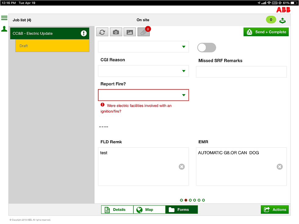
I updated the existing fire tab to build specific responses versus a comment box that was provided previously which allowed users to feel confident in their answer.
With the help of the training and business team, we updated various picklists, which made our comment boxes optional, and removed any questions that were deemed unnecessary or caused further hesitation for our users.

IDEATE: EXPERIENCE 1
Updated text changes for questions
I collaborated with their resident developer about providing users, a proper photos and asset screen rather than the small pop-up modal you see on the image below.
We utilized Apple's framework to provide users a full screen to save photos onto their device natively even when they submitted the report.

IDEATE: EXPERIENCE 2
Asset View integration and improved information gathering
After discussing with business, I proposed we have the fire tab be available to all inspectors in the field, which meant that if and when an ignition does occur, anyone out in the field is able to record the incident without having to submit a formal ticket to gain access to the form itself.
This also allows the user to follow procedure of recording the incident immediately after the event happened.
IDEATE: EXPERIENCE 3
Availability of form for more users
VISUAL DESIGN + CONSTRAINTS
Making due with what you is given to you
Since this application had a previous framework that we could not change, I was given various premade components to work with.
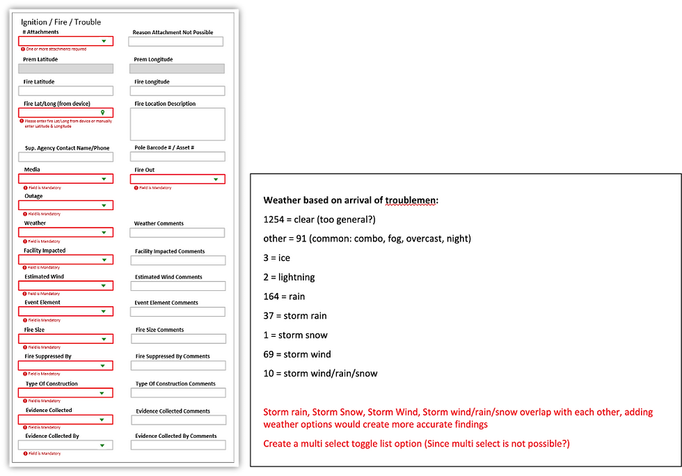
One example was changing from a picklist/comments to toggle switches. In the case of selecting what type of weather was present at the time of the fire, I designed to allow multiple selections for the most accurate information possible. Checkboxes are something that I prefer, due to toggle switches having some disadvantages specifically colorblindness. However, this framework did not have a checkbox option. So we went with toggle switches with a higher contrast to show users what they selected.

PROJECT KICK-OFF
How effective were the changes in data input?
After the changes were put into production, we ran a user survey and user tests that showed:
100% increase in ignition reports
53% increase in user satisfaction
OUTCOMES
Where do we go from here?
Our redesign saw a staggering 100% increase in ignition reports and now made accessible to other inspection teams across California
This project was very insightful to what I do past simply designing and prototyping. This required facilitating different teams across the company, it also gave me space to flex my UX writing skills and expand upon my knowledge on how to enhance an existing platform without necessarily changing the UI. I am very proud of my work on this project because it taught me the importance of being an effective collaborator and communicator, which can make a difference in my designs.
MORE CASE STUDIES
Want to reach out?
Pop me an email at andyk517@gmail.com
I’d love to hear from you!
📍 Currently based: San Francisco and chronically on the internet
©2024 All Rights Reserved